TinyTales | Redesigning the Book Information Page
Role
UX Researcher & Designer
Methodology
Timeline
6-day design sprint
Client
Reading app for bedtime stories
Target User
Families with young children
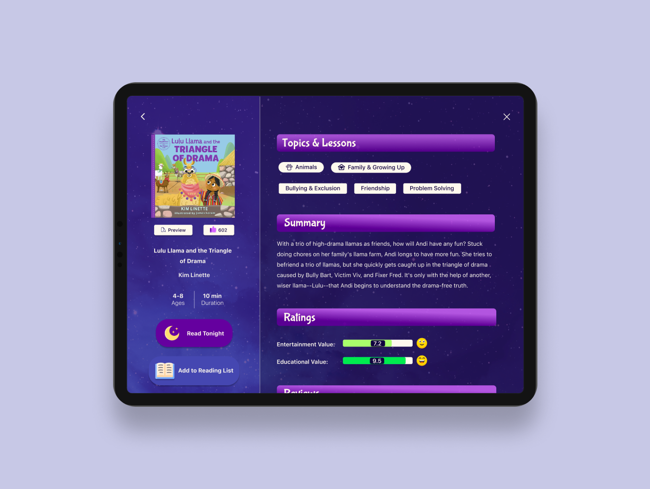
TinyTales expanded their library with new stories, and parents responded with unexpected frustration. What initially appeared to be a problem of choice overload was really a problem of missing information. Rather than browse uncertainly in the app, parents turned to external platforms to find the details TinyTales didn't provide.
I determined the specific contextual information that was missing, redesigned the book information screen to address this gap, and layered in visual anchors for quick scanning and comprehension. Usability testing proved the revisions worked and families could independently select stories without searching external platforms.
This project was a modified Google Ventures design sprint. The TinyTales design sprint challenge was created by BitesizeUX who provided me with the design brief, constraints, and research such as recorded user interviews and user personas.
Context
TinyTales is a startup where authors and illustrators can publish children's stories for families to read together. The app is typically used on a tablet and at bedtime. The company added more stories to their in-app library and was expecting to see growth. Instead, they had garnered frustrated users. Parents expressed that it had become way more time consuming to find the right story to read.
KEY RESEARCH INSIGHT
Families weren't failing to find stories; they were missing critical information to pick the right one.
Families who wanted to bond over a nightly bedtime ritual found themselves with more stories to choose from, but had no way to evaluate them. Parents wanted to select stories intentionally, but they were missing the details needed to do so. Their minds flooded with questions like: Is this age-appropriate? How long will it take to read? What themes and values does it explore? Does it have educational or entertainment value? The problems multiplied for families with kids of different ages and families who read more than one story a night. Time was everywhere and nowhere. Without guidance, families turned to external platforms, and the magic of bedtime reading was lost in endless searching.
DECISIONS MADE
I decided to focus on the book information screen, not the search screen.
The search screen felt important. That's where families started. But I kept asking: even with a perfect search, what happens next? It could still return fifty books and users would still feel overwhelmed. The real friction was not finding a story, it was determining if a story was the right one. The book information screen is where all the questions get answered.
I decided to incorporate images, color coding, and icons for comprehension.
As a former educator, I knew that young children are still learning to read and would heavily rely on visual aids. If they were to participate in book selection, they would need clear and engaging visual anchors. These visuals would also allow parents to instantly process book information without reading in detail.
I decided to develop a design style that catered to being used at night.
This app would be used at bedtime by sleepy families. Every interaction, every color, and every visual needed to feel calm and soothing rather than stimulating. I designed darker screens and used tone words like "bedtime, starry-night, child-like, magical, dreamlike," to inspire the design style.
HOW I DID IT
I began by analyzing recorded user interviews and creating a journey map to trace where families encountered friction. Although I included a detailed search filtering system, there needed to be information to filter through. This is when I discovered the core problem wasn't search engine issue, it was a lack of information issue.
With that insight guiding me, I explored two design directions: kid-friendly layouts versus information-rich layouts. Using Crazy Eights rapid sketching, I identified the book information screen as the most critical moment in the user journey. Then, I storyboarded the complete flow: searching for a story, reading it, and giving a review- an embedded opportunity to collect the data that would be displayed on the book information screen.
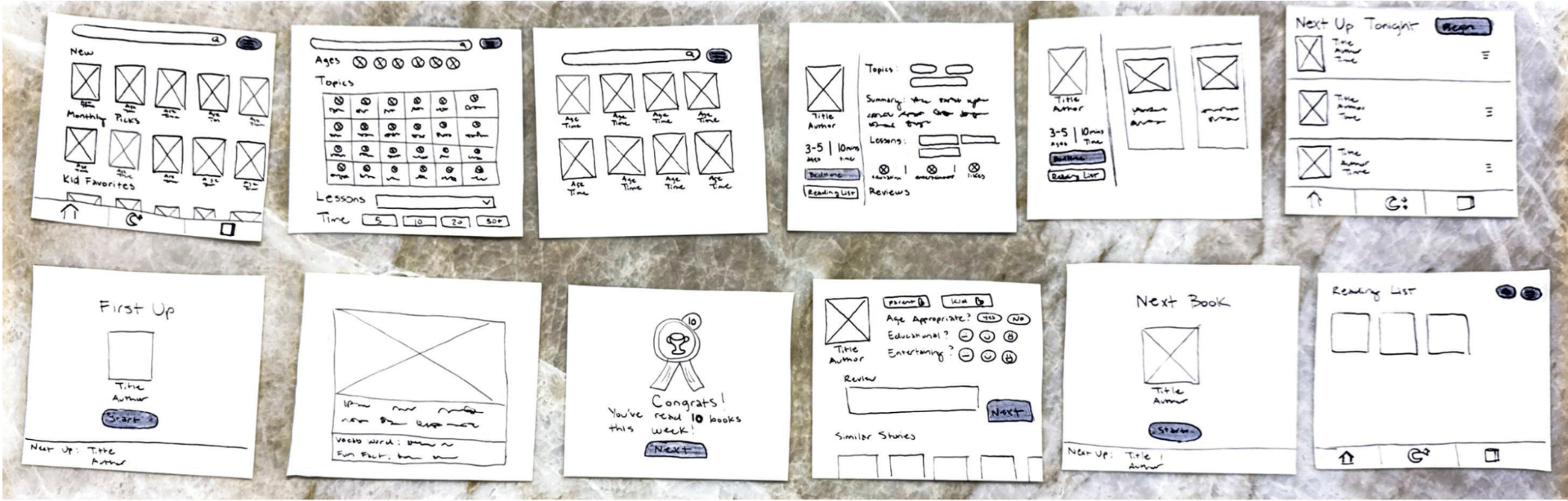
I translated my sketches into high-fidelity Figma prototypes, developed a usability test script, and centered the tasks around choosing a very specific kind of story. Then I conducted five moderated usability tests with two were parents, one uncle, and two were parents that were also elementary educators. Three of my tests were conducted in person and two of my tests were conducted remotely due to scheduling constraints. All test were done on a tablet or in tablet mode.
DESIGN SOLUTION
Click image to view a video of the prototype
RESULTS
- 5/5users
confirmed they had everything they needed to select stories confidently and quickly
- 4/5users
didn't know how to begin reading; they clicked "Read Tonight" and expected the screen to show the start of the story
- 3/5users
tried clicking "Reading List" to start reading, but were uncertain about what it would do
- 4/5users
did not click the filter button when looking for a book using specific criteria, they clicked the search bar
Summary of Findings
Users said the visual design is what stood out and described it as engaging and polished. More importantly, they said it would cut down their decision time. However, a new problem unexpectedly emerged. Nobody knew how to start reading. Users could click "Read Tonight" to add the story to a queue, or add it to "My Reading List" to save it for another night, but there was no clear path to start reading immediately. This led to bigger confusion, leading users to wonder, "What's the difference between "Tonight's Stories" and "My Reading List"? When do I use each one? Why are there so many ways to read?"
NEXT STEPS
If this project were to move forward, I would implement three high-priority changes: Add a path to start reading immediately, add tutorials explaining the purpose of Tonight’s Stories and My Reading List, and combine the search bar and filter system to open together.
Then I would conduct another round of usability tests and measure task success rates, error rates, and ask families directly: Can you explain the difference between each reading method? That answer would tell me everything.
For future phases, I would explore the validity of user requests that emerged in testing like: the ability to read stories in other languages, the ability to mark a book as a "Favorite" or "Already Read" within "My Reading List," and metrics on how many books they've read, how much time they've spent reading, and how many times they've re-read a specific story.
WHAT I LEARNED
Time constraints equals screen constraints.
During the sprint, I originally sketched 12 screens, but time constraints got in the way and I didn't get the chance to prototype them all. Moving forward I would not try to produce more than 10 screens in a sprint.
Make sure testing tasks match the screens.
The reason for the confusion that emerged surrounding how to start reading was because users were tasked to read one story, but the flow I built was for reading multiple stories. It was an oversight on my part. I should have matched the task to the design and vice versa.
Distinguish the core problem from the subproblems and the separate problems.
I unintentionally prioritized the problem of reading multiple stories uninterrupted. That was an entirely separate problem from what the sprint was meant to address, and I confused it for a subproblem.