Things to HOU | Improving Event Discovery & Providing Collaborative Planning
Role
UX Researcher & Designer
Methodology
Timeline
5 months
Client
Event discovery app for Houston, Texas
Target User
Event going Houstonian ages 18-30
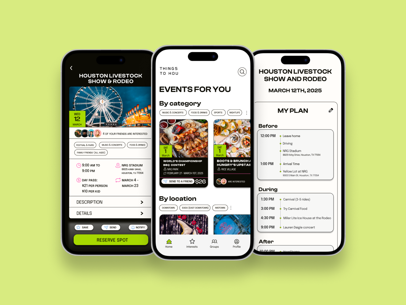
Houstonians struggled to find events happening around the city that matched their interests causing them to stay home and miss out. If they found something to go to, they struggled to gather details, remember them, and coordinate with friends. What initially appeared as a discovery problem was really a symptom of a larger issue: a lack of systems and support throughout the event attendance journey.
My research mapped exactly where users needed support within the event attendance journey. My design included personalized event recommendations, detailed event information screens, a reminder and management system, and a collaborative planning tool for group coordination. Usability testing revealed users loved the product concept and design, but the planning flow needed more automation.
This was a 0:1 project where I attempted to solve the problem of finding things to do in my area. I created a fictional company and app that allowed me to explore and develop my UX practices.
Context
Houston, Texas is the fourth largest city in the USA, and yet it remains to be a struggle for locals to find events happening in the area. As a native Houstonian, I experienced this frustration first hand: searching multiple online platforms only to find nothing of interest, or just to find out about an event after it already passed. It was rare that I actually found something to do with my friends, much less go. I suspected we weren't alone in this struggle, so I initiated this project to find out.
KEY RESEARCH INSIGHT
Houstonians were not just struggling to discover events; they lacked the information, systems, and structure needed to manage everything it took to be able to attend.
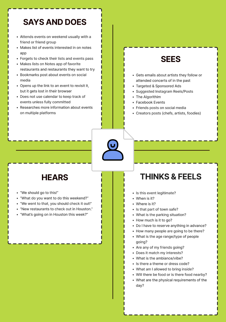
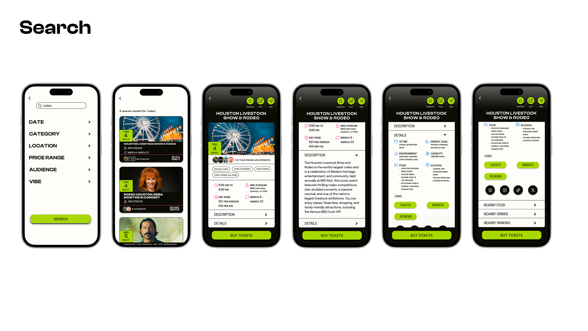
Event discovery wasn’t intentional, it happened passively. Houstonians stumbled across events through social media, ads, posts from friends—but basic event details like location, cost, date, or time were either completely missing or unclear. This forced them to spend time conducting their own research and cross-verify information across multiple platforms. They sought out as many additional details as they could get: what is the parking situation? Is it indoors or outdoors? Is it a lot of physical activity? What should I wear? Will there be food and drinks there? When they found an event interesting, they tried to "save" it by leaving tabs open, writing notes on their phone, or bookmarking posts. Even though they intended to circle back, rarely did they actually return. Events got lost, forgotten about, and opportunities were missed. If they remembered about the event: every single person said the same thing in different ways, "I want to go, I just don't want to go alone." However, coordinating with friends brought its own set of challenges. It was the final, yet most critical barrier participants faced.
DECISIONS I MADE
I decided to challenge my own assumptions and validate the problem was worth solving.
Before designing anything, I first confirmed event discovery was a widespread problem by examining academic articles, market research reports, and online forums. I learned why the issue persisted and who it affected most, but had little insight into the user experience. To close this knowledge gap, I interviewed people within the target demographic in the Houston area. By gathering local, current, and personal accounts of the user experience I obtained the concrete evidence I needed to guide my solution ideation process.
I decided to pivot and solve the entire event attendance journey, not just discovery.
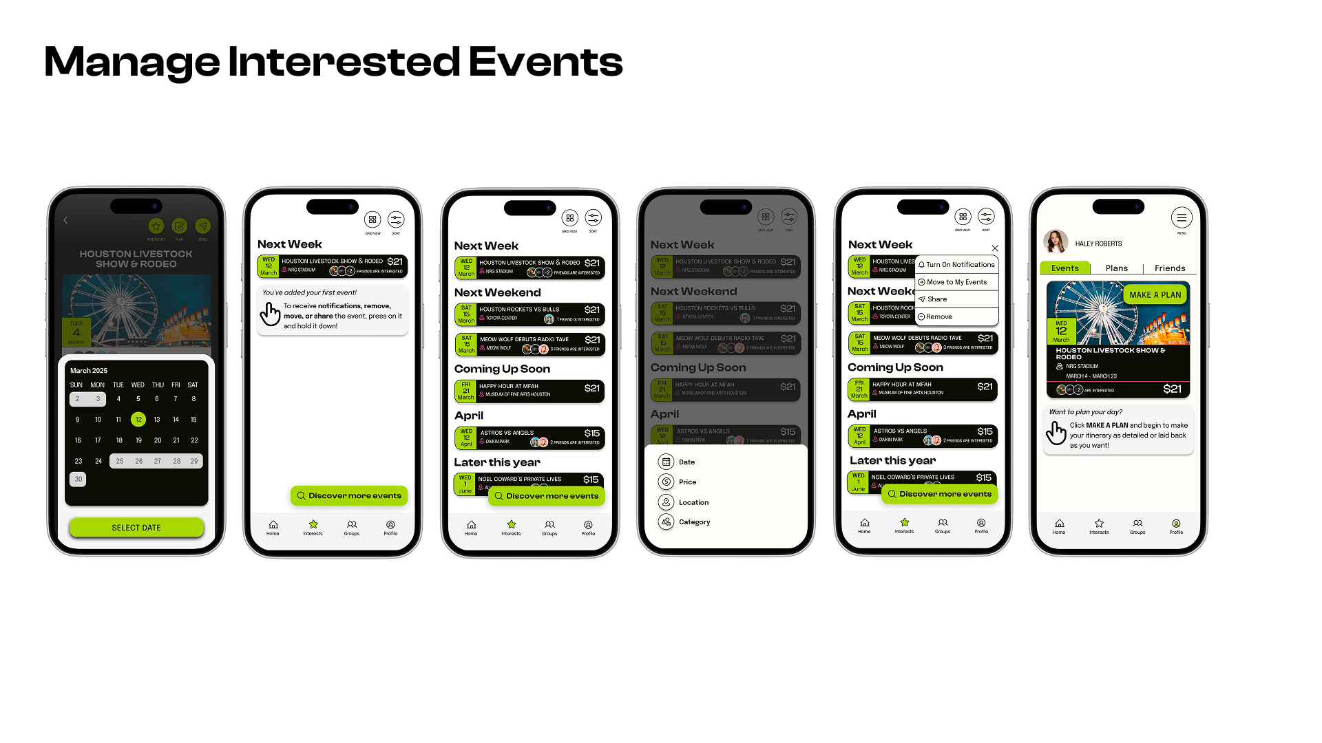
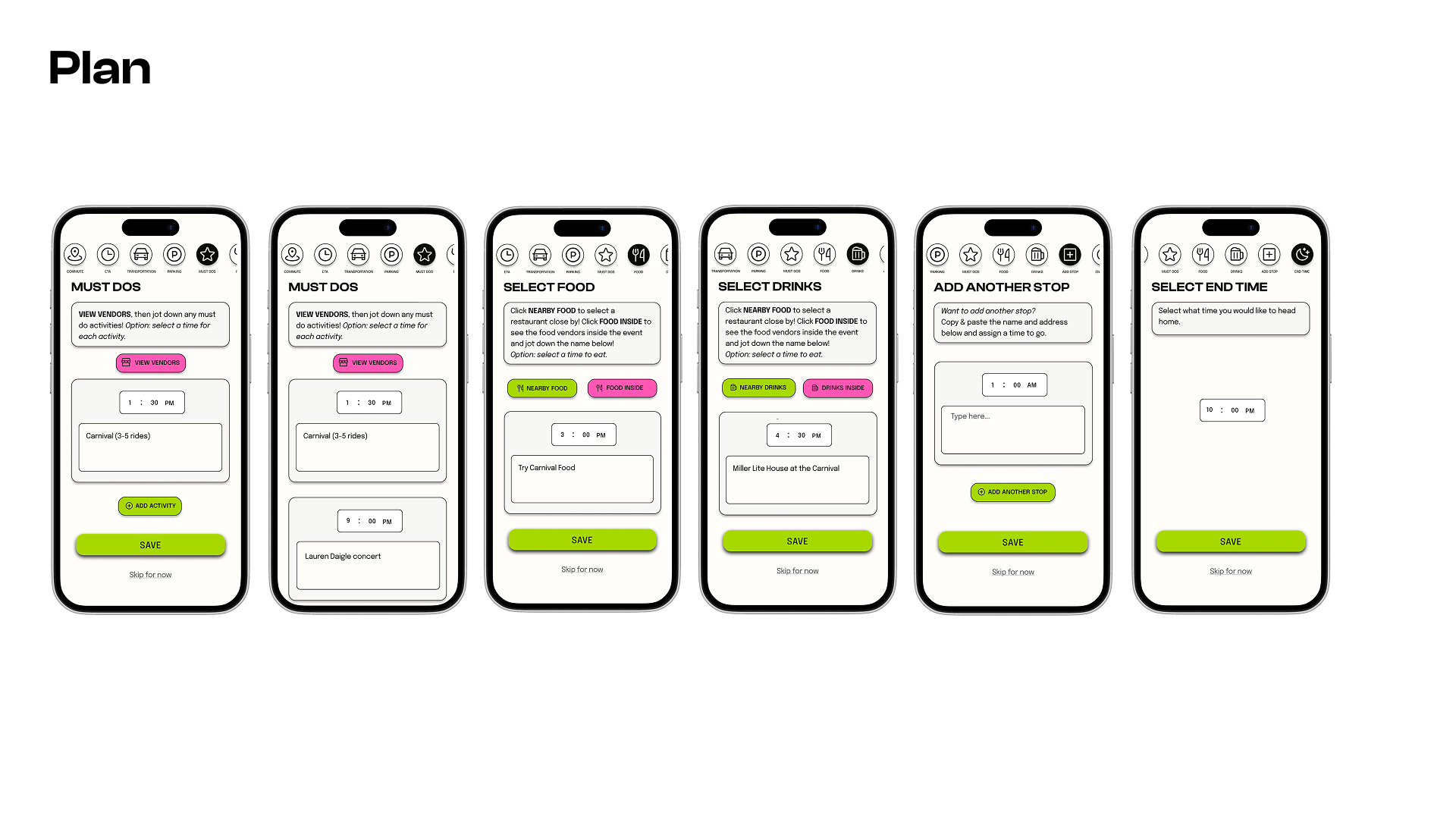
Event discovery was just one point of friction within a larger issue: a disjointed event attendance journey. This reframed the entire problem. I determined users needed a way to receive personalize event recommendations, easy access to detailed event information, a system to remember events they were interested in, a place to manage those events, and opportunities to connect and coordinate with friends. By shifting focus, I ensured I was making a product that solved the entire core problem, not just a single subproblem.
I decided to prioritize opportunities for social interaction and collaboration.
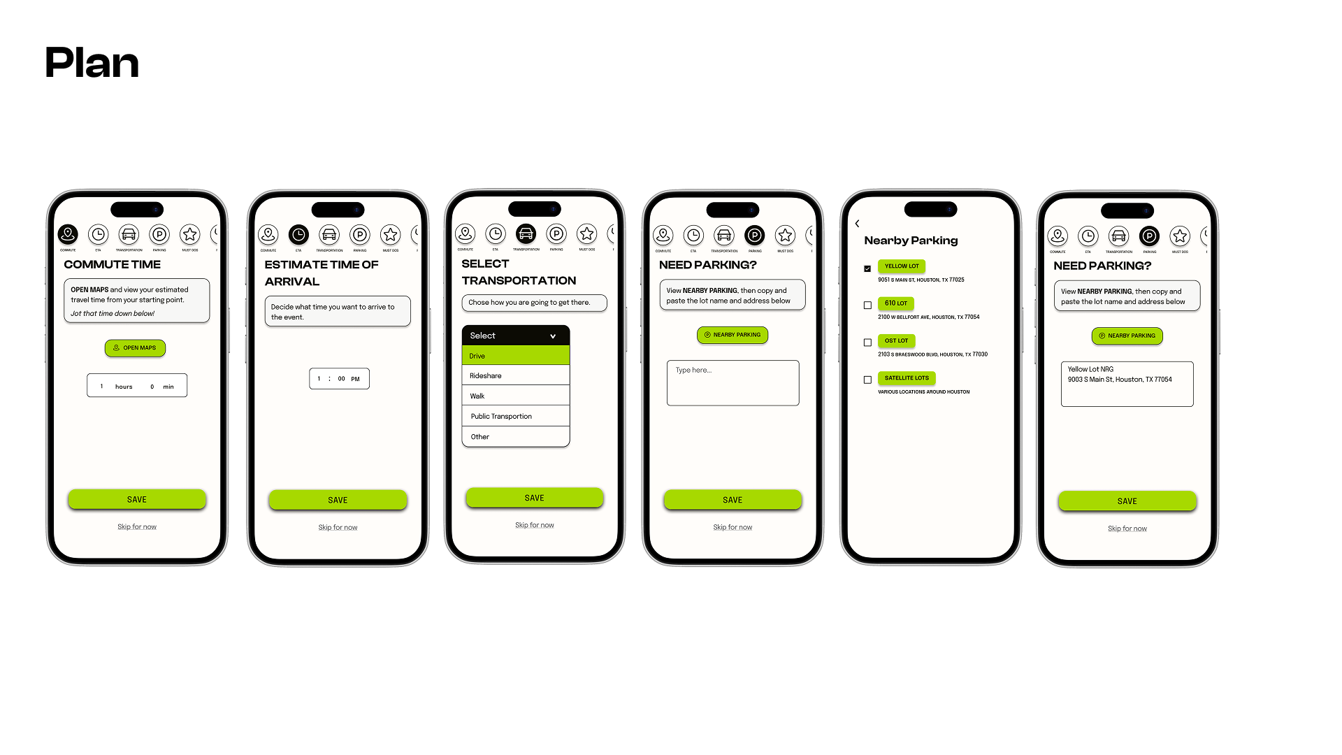
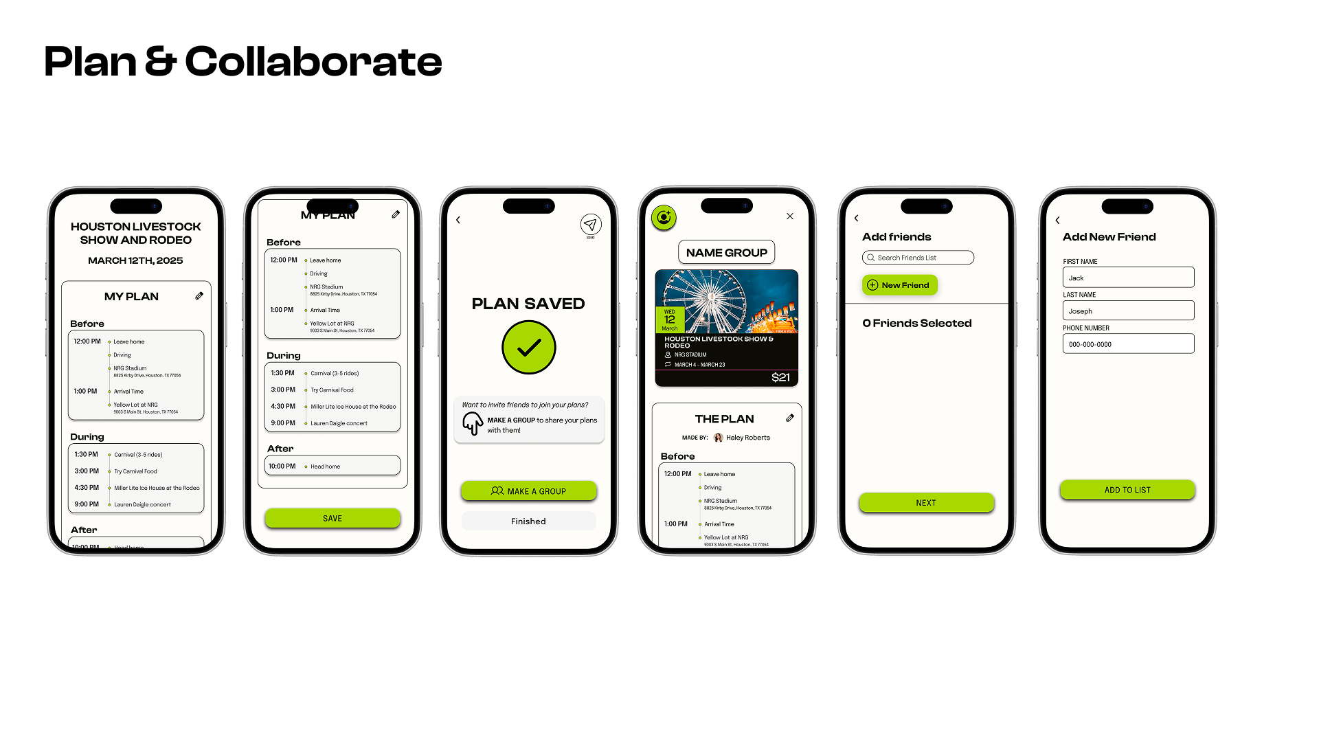
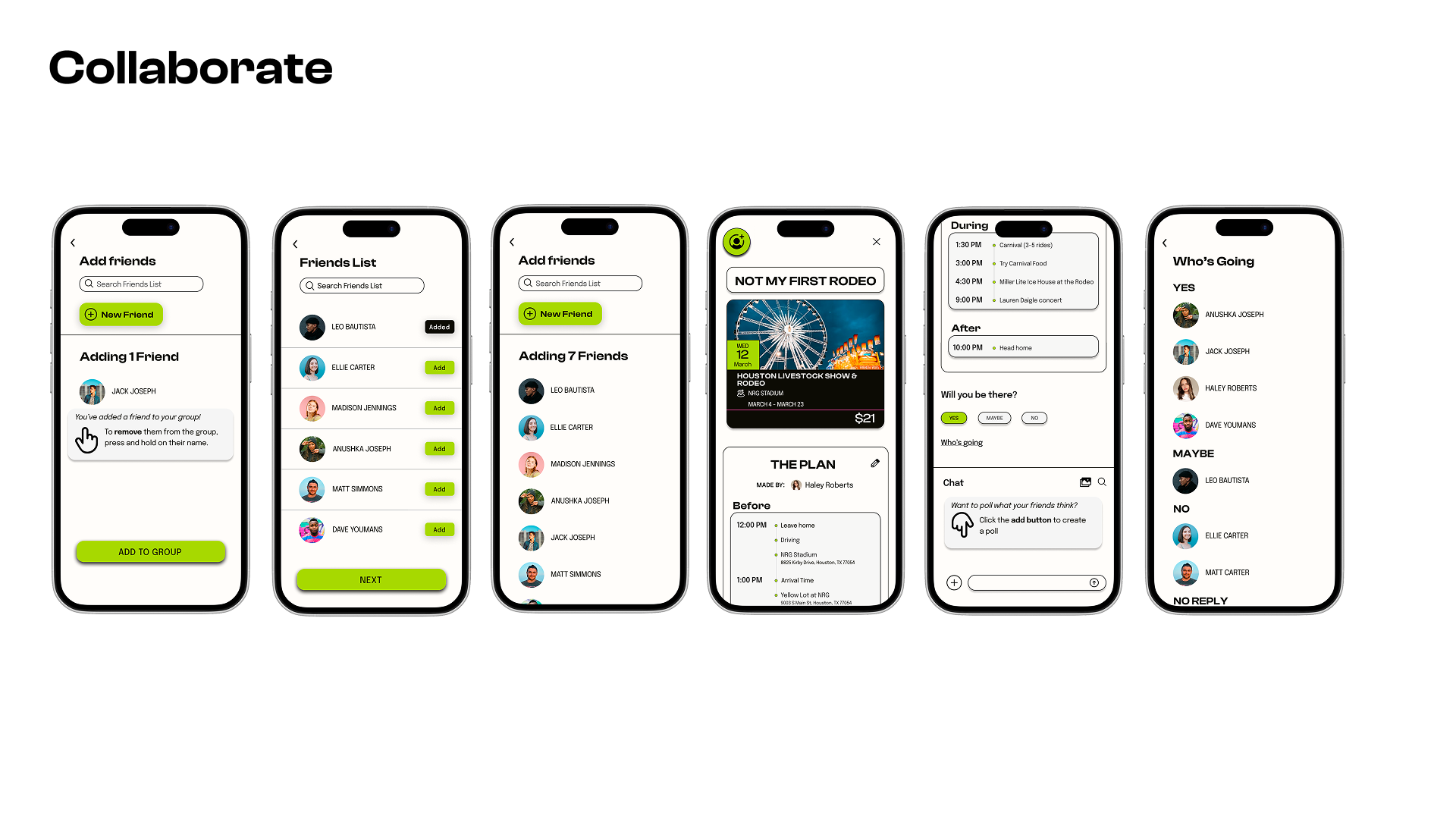
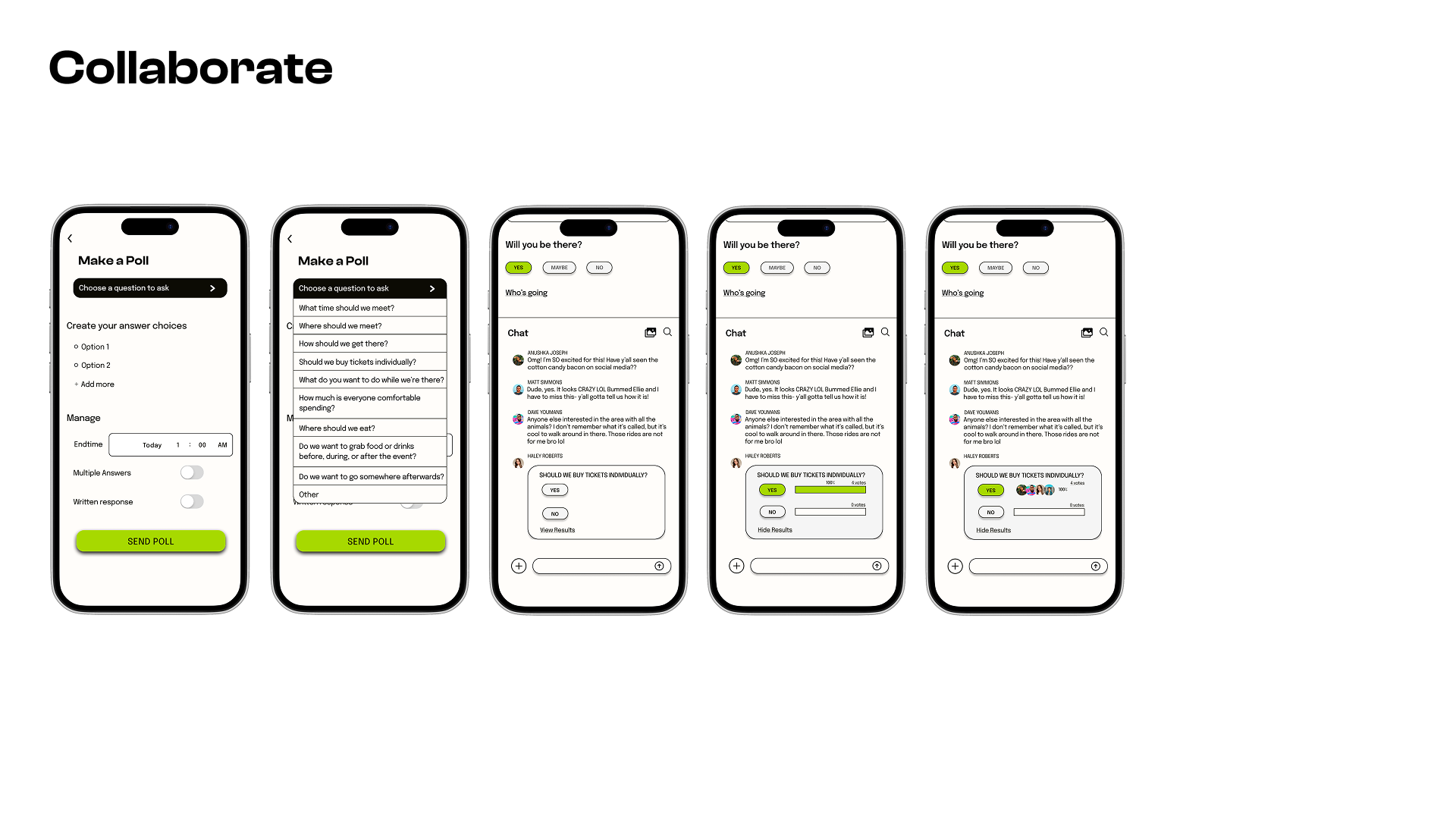
Event attendance was a social decision, but bad communication and group coordination often prevented plans from actually happening. I added cues throughout the app to trigger conversations about events and built a collaborative planning system where these conversations could develop into streamlined coordination. This would not only address a key user need, but also create more opportunities for sustained engagement beyond one-time event searches.
HOW I DID IT
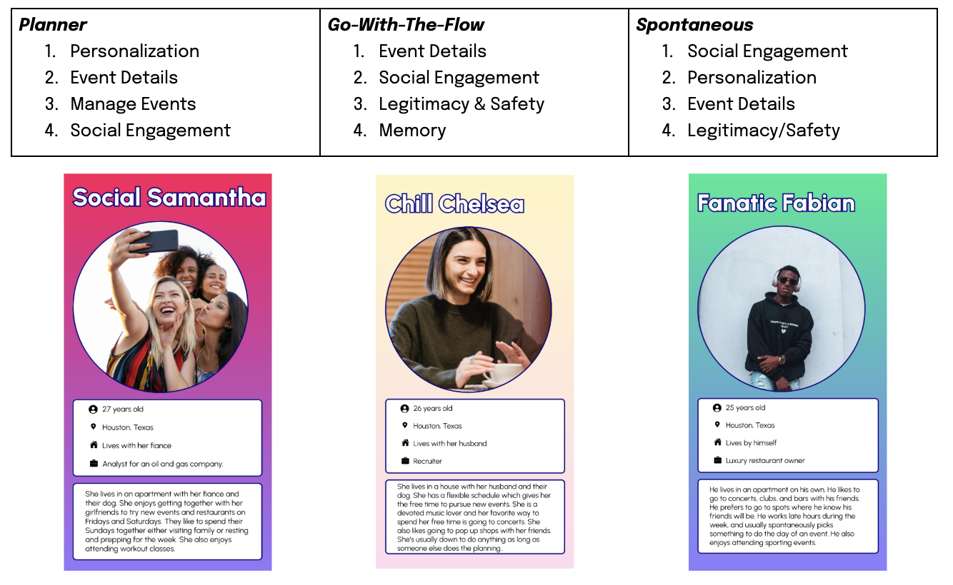
I conducted secondary research which validated the problem and pinpointed my target demographic, but I wanted to understand the lived experience. I developed specific research questions: What methods do people use to find events in Houston and why do they prefer them? How do they manage remembering all of the options they're interested in? What convinces them to actually pursue attending an event? How do they feel about their process of finding events to attend in Houston? I recruited event-going Houston residents ages 18–30 and coordinated five interviews (four in-person, one remote) to find out. Through analysis, I identified seven subproblem groups, created an empathy map, and developed three personas based on decision-making styles: Planner, Go-With-The-Flow, and Spontaneous. This helped me prioritize which problems to solve in my MVP and brainstorm four core solutions that housed each within three red routes: Sign Up & Register, Manage Interested Events, and Plan & Collaborate On Events.
I wrote user stories, mapped user flows, completed a heuristics analysis of existing Houston event discovery platforms, and developed a style guide inspired by a blend of Houston nicknames and scenery. I developed a brand concept channeling the trustworthy, trendy energy of a school morning announcements host. and lively hub for discovering what’s happening in Houston.

Finally, I conducted two rounds of usability testing with eight Houston residents. Six were Gen Z and two Gen X product professionals). Five tests were in-person, three remote. I focused on core tasks—discovering, saving, and coordinating events—and prioritized issues by severity after each round.
Solution
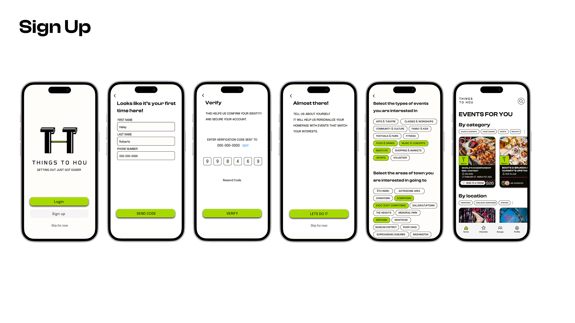
1 / 9
Results
- 3/3users
wanted to know details about vendors and activities offered inside the event, not just nearby
- 2/3users
expected to see start times on event cards for non-recurring events
- 2/3users
incorrectly tried to select a different date by clicking the plan button instead of clicking the date button
- 2/3users
expected more automation and final plans displayed in chronological order in the planning flow
Summary of Findings
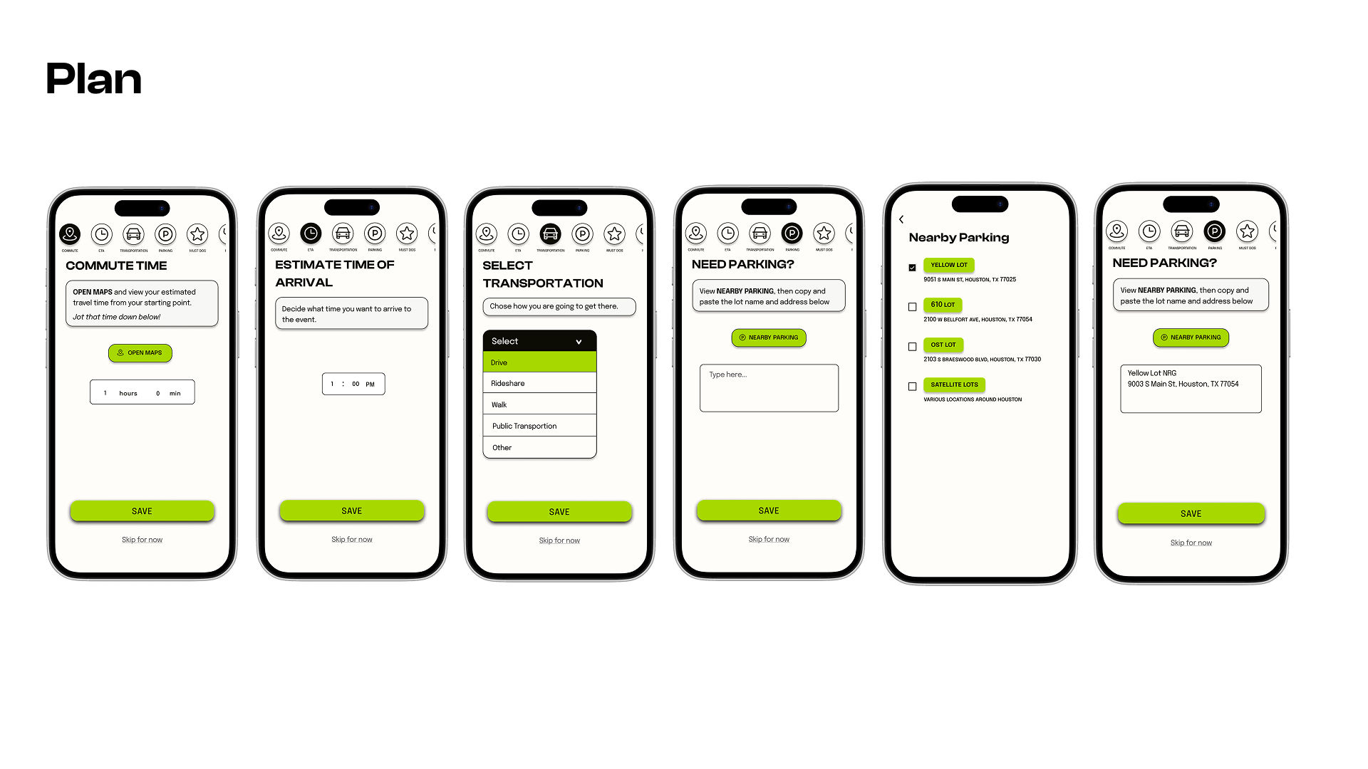
Overall, users loved the amount of detailed information given for the events. However, there was one missing detail everyone wanted to know: the exact vendors inside the event. Separately, the interactions were not always intuitive. Some buttons and screens were incorrectly linked causing confusion. The planning flow was were the bulk of issues lived. User did not enjoy being tasked with copy and pasting addresses of destinations throughout the process and some even said that point of friction would make them skip the planning process entirely. Additionally, they wanted to be able to view their plan in a chronological schedule format, not chronological order of how they input the information in.
Next Steps
Due to time constraints I could not complete an entire third round of iterations. However, I had some time to partially implement the user feedback and created a couple of new screens which are displayed as part of the final solution above. I fixed the incorrect links, redesigned the final screen in plan process to display a chronological schedule of the plans, and added the ability to select destinations from a list that automatically adds the address.
I was able to add a link to vendor details in the planning flow, but did not have the time to incorporate them into the event details screen. If I had more time, I would have explored a redesign or implemented a tutorial for changing the date on the event detail screen. I would also add event times directly to event cards so users get that basic information at first glance. To assess the effectiveness of these changes I would conduct another round of usability testing measuring task success, error rates, and time on task in the planning flow.
WHAT I LEARNED
Intentionally select a few synthesis methods and design approaches, not all of them.
This project was apart of a bootcamp where I was assigned to complete a variety of synthesis methods and design approaches for the sake of the learning experience. However, the extraneous methods made the project take way longer than it needed to and eventually resulted in redundant outcomes.
Deliberately differentiate where each flow ends and the next begins.
The "Plan & Collaborate on Events" red route was too broad and I should have split it into two distinct flows. That focused approach would have revealed interaction issues earlier and let me test each flow with the rigor it deserved.
Only build what your going to test.
This was my first UX case study and I did not full understand the appropriate scale and scope of a prototype. I was trying to build out the whole product, but just I ended up wasting time building screens and features that were never seen by users in testing.